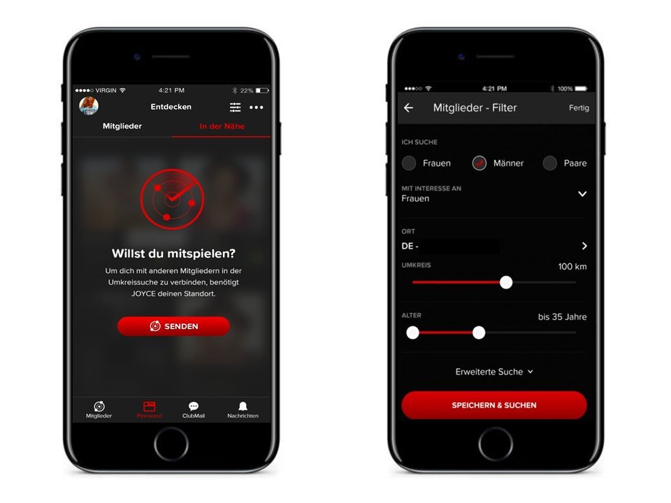
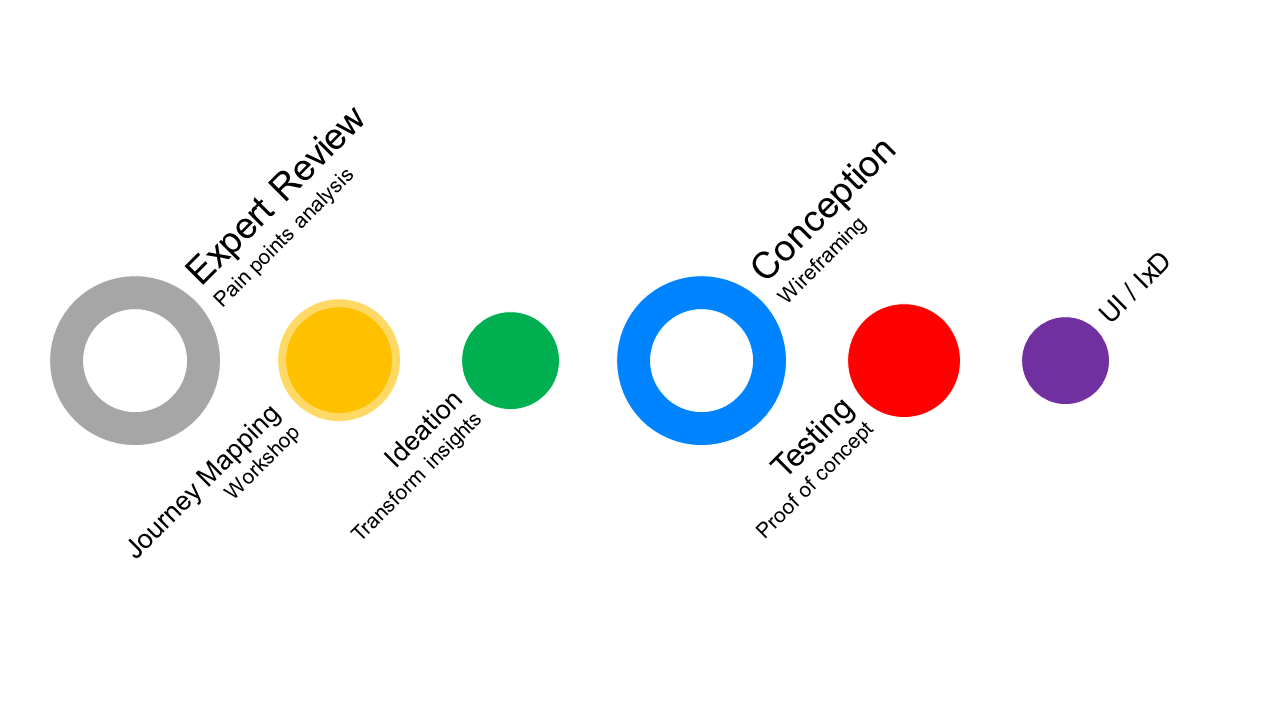
Initial UX – UI Concept, Usability Engineering, User Flow, Wireframes, IxD
FEIG & PARTNER
JOYCE APP – DATING PLATFORM
Create a dating app, based on the most wanted features of the joyclub community.
Provide best user experience with enhanced chat and communication functionality.
Key Painpoints
- No responsive desktop
- No native app concept
- First implementation failed 2016
- High complexity
- Too many features
Project Goals
- Prioritization of features
- UX concept for native app
- Cover the basic needs of the users
- Early prototyping and testing
- Best UX for mobile usage
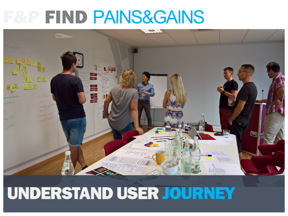
Workshop
Find out basic needs of the existing community member features. Prioritize most relevant features, must haves and nice to have. Avoid feature crap. Align the business with the users needs. Generate ideas and a holistic view of our goals.
Needs
Use the power of a team to generate the best ideas and solutions regarding the perfect journeys. Try to focus on pain- or distractino points of the user. Use Design Thinking methods to reveal the unseen.
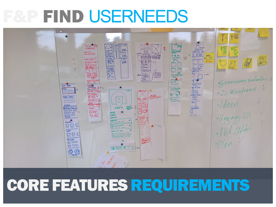
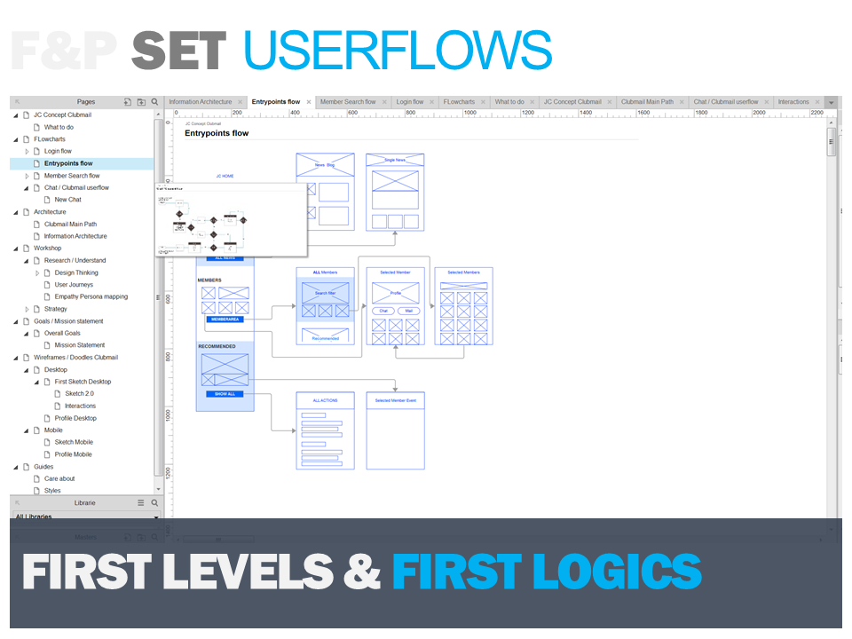
Flows and Structure
Provide clear orientation and flows for the user. Support him in his mental model to get his tasks done. Avoid confusion while interacting. Get the flows right to get a smooth and logically structured path.
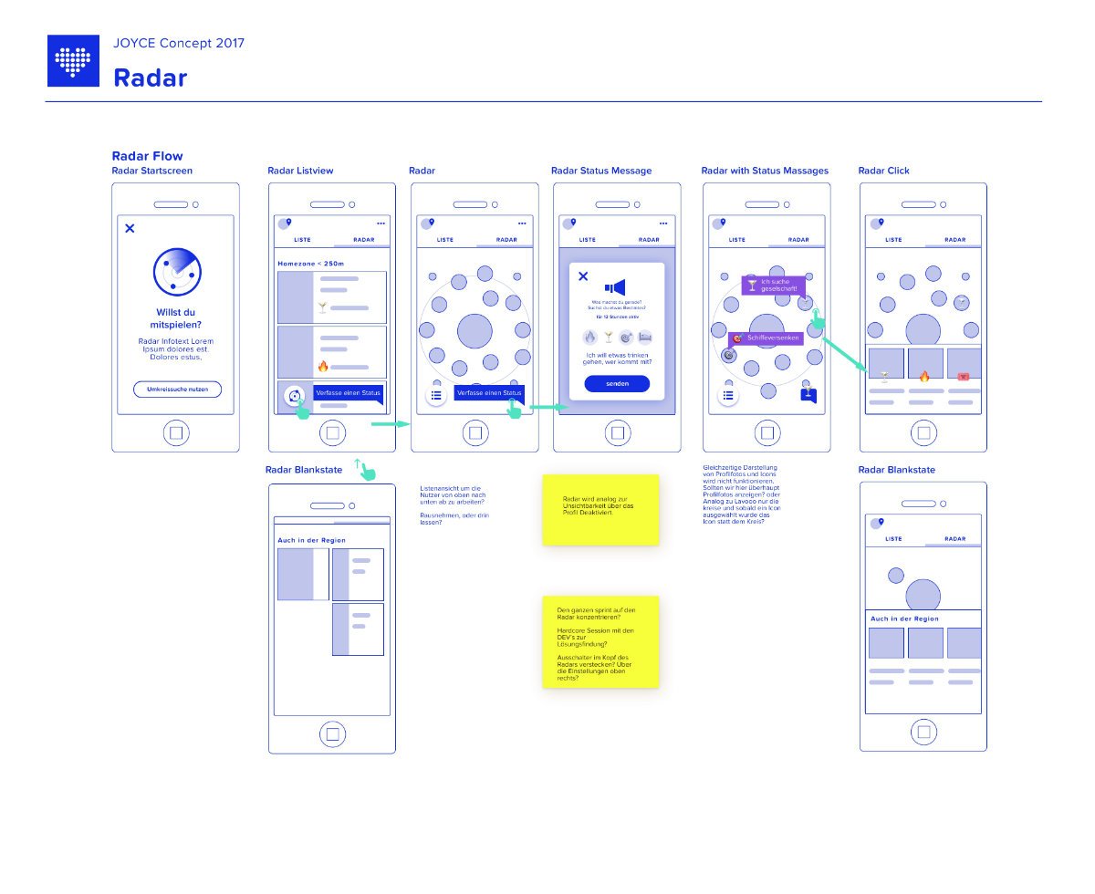
Interaction Flow
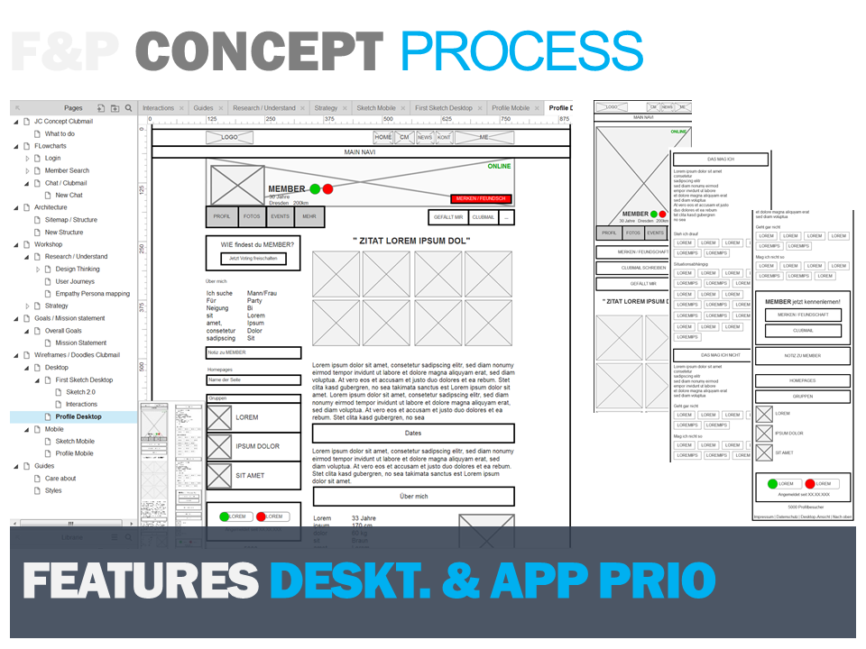
Generate wireframes to test our solutions. Reduce distraction points in the user flow while testing. Provide easy orientation with e.g. vertical and horizontal navigation logic. Try to implement the insights of the research phase.
Specify
After proof of concept, specify the rough wires into more concrete interactions to get one step closer to authentic look&feel.
Mockups
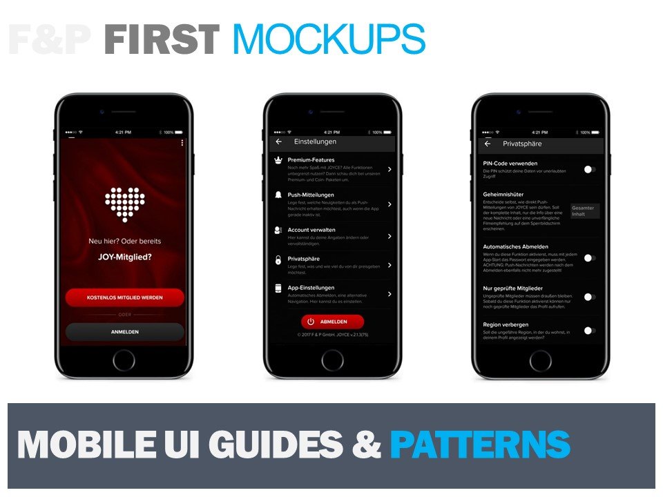
Proof proposals with lofi and hifi mockups to verify contentsections and layout structure.
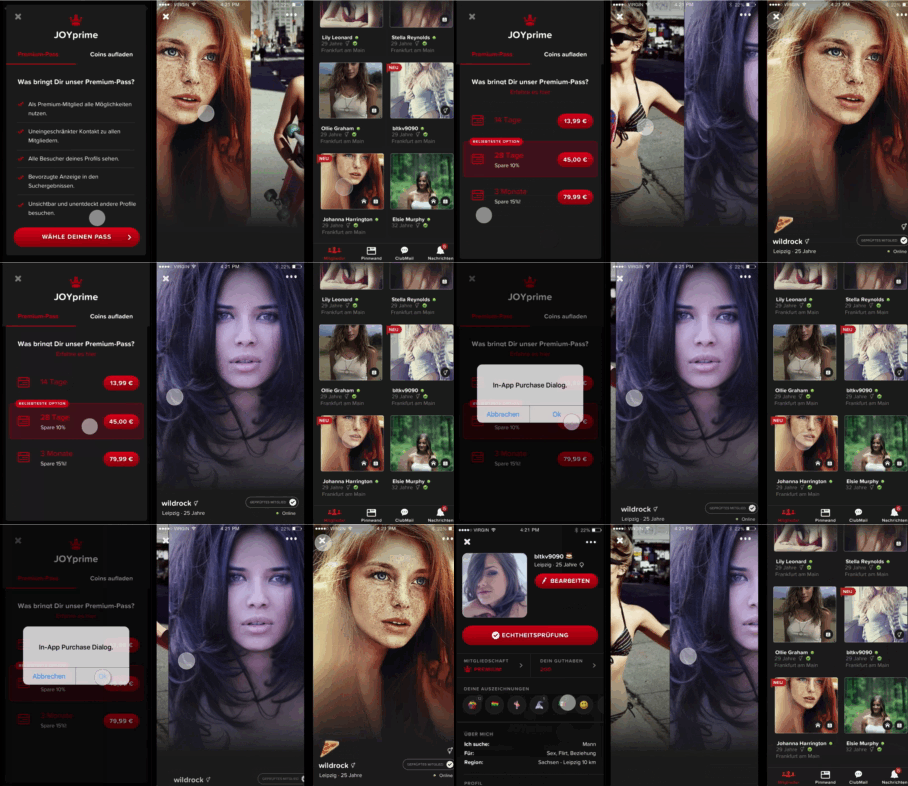
Prototype & Test
Test the look & feel. Optimize navigation, site transitions, effects. Try to get a visual appeal on the users mind.
Visualization IxD Design
Finally align the brand identity with the app elements for the value of brand recognition. Consider the different guides for mobile patterns e.g. touch target size of iOS indexfinger 44px x 44px…
